I stumbled upon some new marital status data over at the US Census, and thought I’d share the charty goodness. First up is the median age of marriage, going back to 1890:
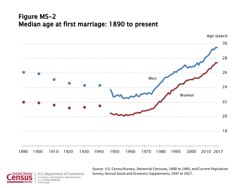
From the accompanying spreadsheet, you can see that the median age for women crossed into uncharted territory in 1979 at 22.1, breaking the 1890 record of 22. For men, the median age of marriage didn’t exceed the 1890 value of 26.1 until 1989 when it was 26.2. As of 2017 the median age of first marriage for men and women was 29.5 and 27.4, respectively.
But the median age of marriage only tells us about the men and women who do marry. The next two charts give a bit of a look at marital status trends overall.
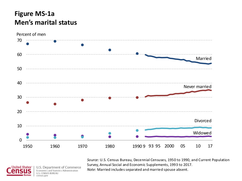
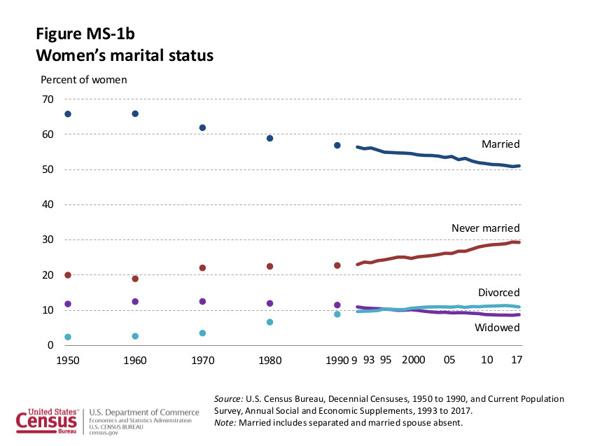
Note that the top two lines on both charts (married and never married) are driven in part by the increase in age of first marriage. When men and women marry later they spend a smaller percentage of their adult lives married, and a larger percentage counted as never married.
If they had the nevermarried data broken out by age bracket like I was able to do in the past, we’d have a better understanding of how much of the trend is delayed marriage vs not marrying:
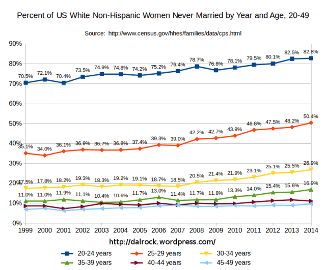
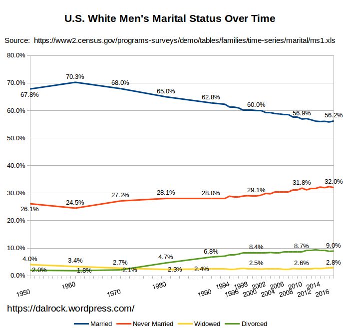
The other limitation with the Census charts included above is that changing racial and ethnic demographics could be driving part of the changes we see. Marriage and divorce rates vary widely by race, so it could be that the changes we are seeing in recent decades are due more to racial and ethnic changes than due to an overall societal trend. Fortunately the Census offers a spreadsheet with the marital status data broken down by race and ethnicity. I didn’t take the time to chart this out for all races, but here is what it looks like for White* men and women:

I’d love to see the same breakdown for Blacks, Hispanics, and Asians, but for the sake of time I stopped where I did. If you decide to chart this out yourself please let me know so I can add a link to your charts.
*The data in the two charts I just created is different from the data I’ve charted out in the past because 1) It isn’t broken out by age. and 2) The former is for White, and the latter is White alone non Hispanic.
Edit: I updated the two new charts to show continuous lines.
Leave a Reply